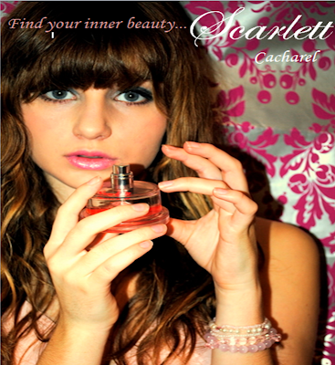
Firstly I used the colour pink to reflect that the magazine is for girls, and pink is a very clique girlie colour. The font is also in italic script to give off a more elegant, sophisticated feel to the who advert. I feel that the backing of the photography ties in nicely with this feel as it is posh and looks like something that you would see in a manor house, but with a modern twist.
The advert is modelled by Eva Brooklyn again who is the main theme of the whole magazine. I chose to use Eva because it shows how diverse and famous she is reflecting on the readers views on her. I decided that I wanted to use a perfume advert in my magazine because I feel it is appropiate for my target audience, and it is actually something that they would possibly be interested in buying. After researching many different magazine perfume adverts I realised they are all portrayed in a very exotic, classy way. The main advert I focused on was a perfume called Pretty by Elizabeth Arden. I decided to focus on this perfume because I feel it was trying to send out the same message as I wanted my advert to do.
Overall I was happy with the outcome of my music magazine advert. I am please with how the font and colours create the mood of the advert and how the audience and product is clear.


No comments:
Post a Comment